

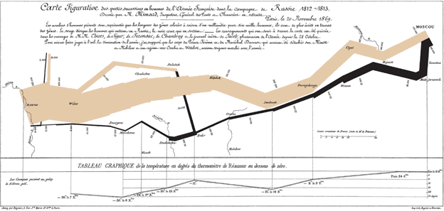
One of my favorite uses of visualization is Charles Joseph Minard’s map of Napoleon’s disastrous Russian campaign of 1812. In fact, I have a framed version of it hanging just outside of my office.
The graphic is notable for its representation in two dimensions of six types of data: the number of Napoleon’s troops; distance; temperature; the latitude and longitude; direction of travel; and location relative to specific dates. He created it in 1869.
The proper use of visuals, graphs, and charts leads to good story-telling. And in the work we do with clients, these stories fall into a few categories.
- Setting goals
- Tracking trends over time
- Demonstrating Success
- Showing opportunities for improvement (what’s not working)

When tied together properly, organizations can tell powerful stories. The messages developed with these visuals can be used for both internal and external communications.
Helping staff see how their work impacts clients increases employee engagement which, in turn, improves a whole variety of other metrics for the organization. (See Gallup link below).
“Simply put, engaged employees produce better business outcomes than other employees do — across industries, company sizes and nationalities, and in good economic times and bad.” ~Gallup article
Setting Goals – Setting goals or targets clearly communicates the direction you want to take your organization. Displaying them in a visual sets them in concrete for everyone to understand. Goals or a True North works as a compass proving a guide to take an organization from the current condition to where they want to be. It might be viewed as a mission statement, a reflection of the purpose of the organization, and the foundation of a strategic plan. Setting goals or targets provides a precise, concise, and universal set of ideals which, when taken together, provide a compass that transcends any particular organization, strategy, geography, or culture.

Tracking Trends over Time – Data tracked over a period of months will reveal trends that you might not notice on a day-to-day basis. People typically use a line graph or a bar graph to show trends because they allow you to draw a connective line either up, down, or steadily across.
Importantly, at a glance, everyone knows how the organization is doing on a particular metric. Trend charts are easily digestible and provide insights into where there are opportunities for improvement.
Demonstrating Success: We need to take time to celebrate success. It is the reward we get for the hard work the team puts into achieving the organization’s goals. Additionally, we all have those we need to report to, be it a board of directors in the private sector or a legislative body in the public sector. It’s one thing to tell someone about your achievements, but actually showing them will make more of an impact on readers. Say your company has achieved a goal like reaching a certain number of active users. Rather than just announcing the number, you can show the milestone using a chart.

Showing opportunities for improvement – As important as celebrating success is, identifying opportunities for improvement is just as vital. Being able to be open and transparent about problem areas is a necessity for continuous improvement.
Employing problem solving tools to the deficient processes identified by the visual metrics is critical to improved performance, higher customer satisfaction, and more employee engagement.
In the end, telling a compelling story with visuals provides a great many benefits. Ensuring you are measuring the right activities and outcomes is the key. Then using the information to achieve actionable insights is the key to successfully growing your business.
Best regards,
Scott Harra, EVP of Marketing and Government Relations
Links to Resources
Thought Leaders:
Martin Wattenberg – Google
Fernanda Viégas – Google
Books
The Wall Street Journal Guide to Information Graphics: The Dos and Don’ts of Presenting Data, Facts, and Figures
Resonate: Present Visual Stories that Transform Audiences